How do I trade using daily weekly and monthly charts?
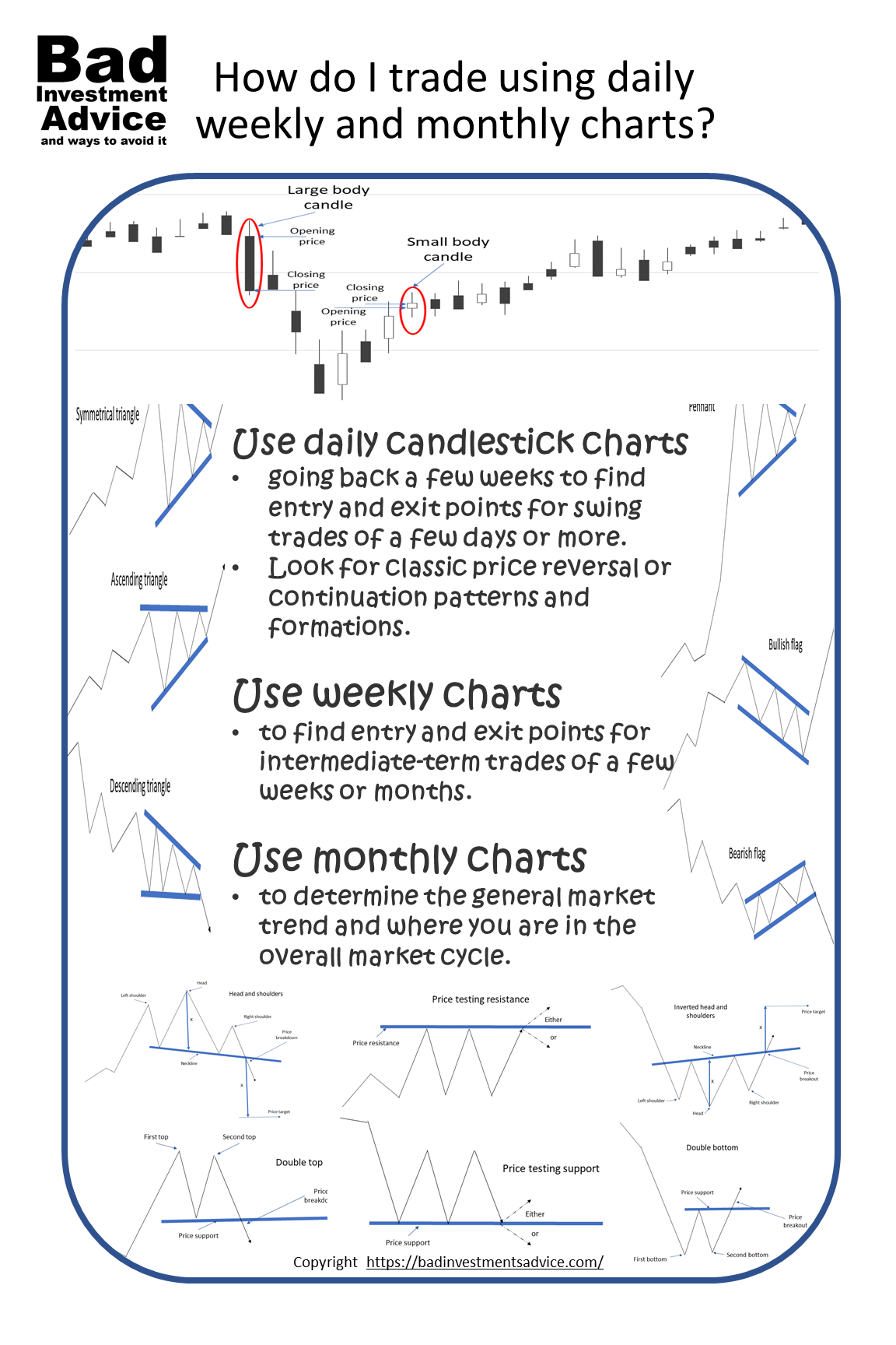
Use daily candlestick charts going back a few weeks to find entry and exit points for swing trades of a few days or more. Look for classic price reversal or continuation patterns and formations. Use weekly charts to find entry and exit points for intermediate-term trades of a few weeks or months. Use monthly charts to determine the general market trend and where you are in the overall market cycle.
The general principle for individual investors is to follow the money. Try to trade and invest where the large institutions are investing. The best short-term entry and exit setups will be when you spot a trend likely to reach an area that will trigger computer-driven trading.
Charting basics
Stock price charts come in a variety of forms. For our purposes there are,
- simple line charts that consist of a line connecting usually closing prices,
- open, high, low, close or, OHLC charts, and
- candlestick charts
There are certainly many other kinds of charts. In particular, point and figure charts are really useful for understanding long-term trends but we will save point and figure charts for another time.
Basic line charts are obvious and intuitive. Most people will have seen candlestick charts and will associate them with stocks, forex, or commodity trading.
Line charts
The simplest chart to use and understand is the line chart.
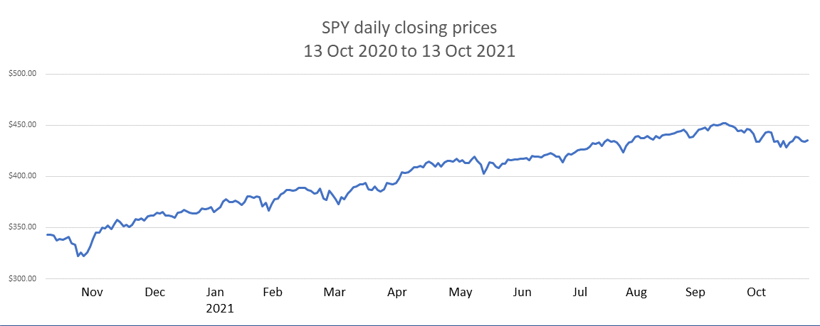
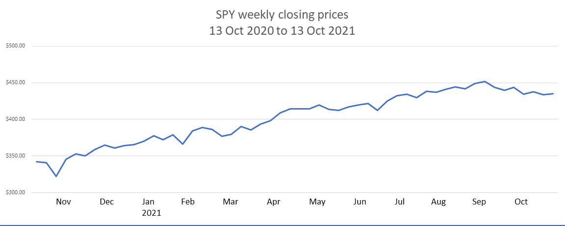
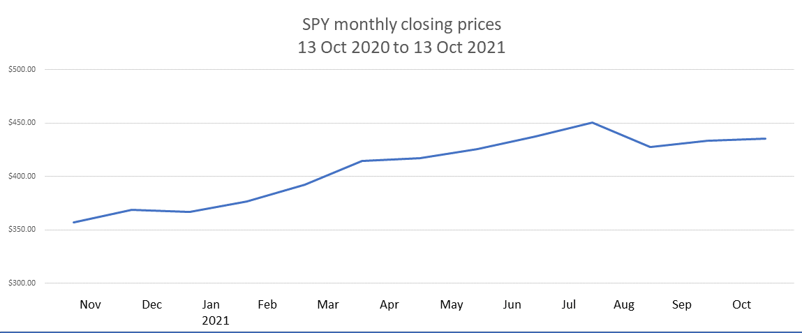
A line chart usually connects the closing price of a stock or ETF for the period we are considering. So a daily line chart connects the daily closing prices, a weekly line chart connects the weekly closing prices. Clearly, if we compare a daily chart with a weekly chart for a stock for the same period, the daily chart will show more variations and the weekly chart will show fewer variations.
Here is an example for the ETF SPY that tracks the Standard and Poor’s 500 Index, daily, weekly, and monthly closing prices for the period 13 October 2020 to 13 October 2021.
1)Stock data source: Yahoo Finance, all charts by Bad Investment Advice.
As we can see the daily chart shows a lot more detail than the weekly which in turn shows more detail than the monthly chart. This illustrates a very basic point. If we are looking for detail within short time frames then the detail shown in a daily chart is going to be relevant. But if we are looking just to understand the general trend over months or over the whole year, then the less detailed monthly chart is relevant and much easier to read.
Depending on what we are looking for determines whether we need the detail in a chart or whether that detail can just become unnecessary noise.
Candlestick and Open, High Low, Close – OHLC Charts
Candlestick charts and OHLC charts are very similar. They both display the same information but in a different way. This is how to read candlesticks and OHLC charts. Whether you chose to use candlestick charts or OHLC charts depends on what your brokerage platform provides and is a matter of personal preference.
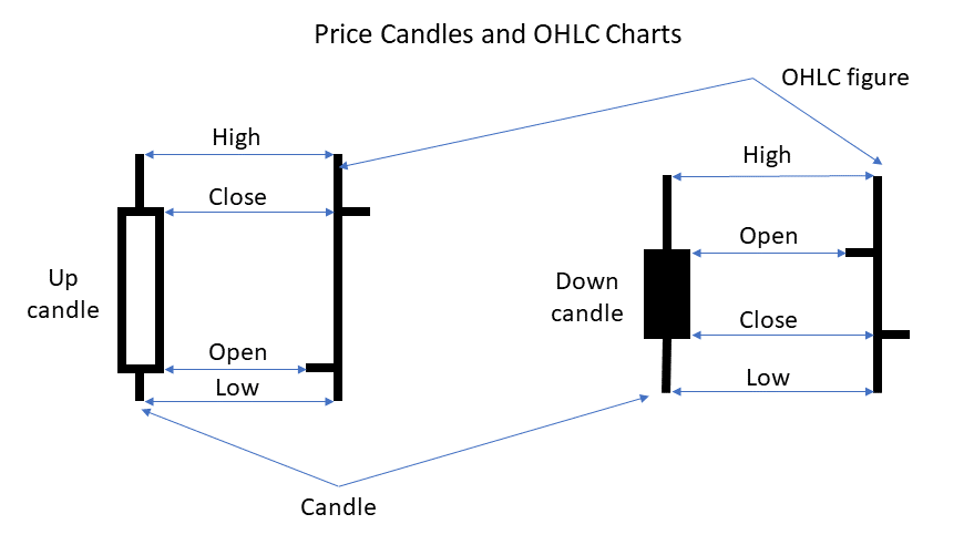
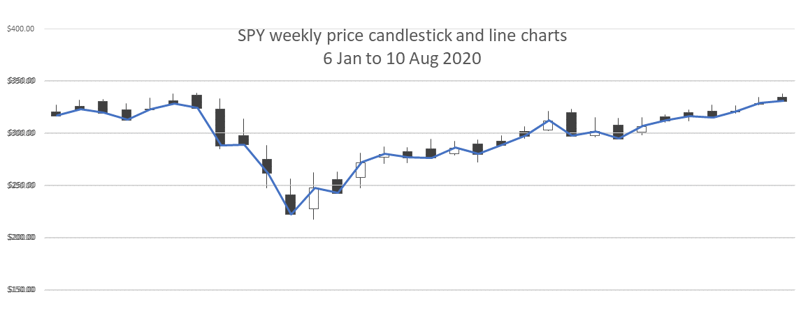
Candlestick charts contain more information than a line chart that just connects closing prices. As we can see here the line just connects the same points as the closing prices on the candles.
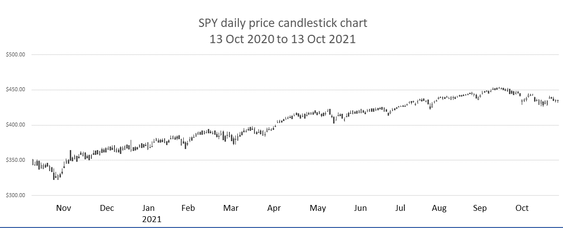
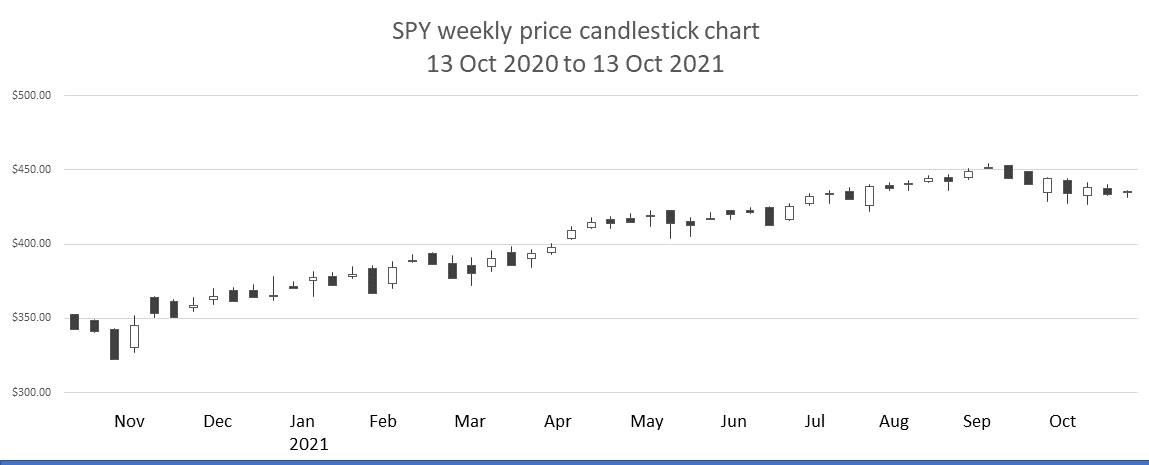
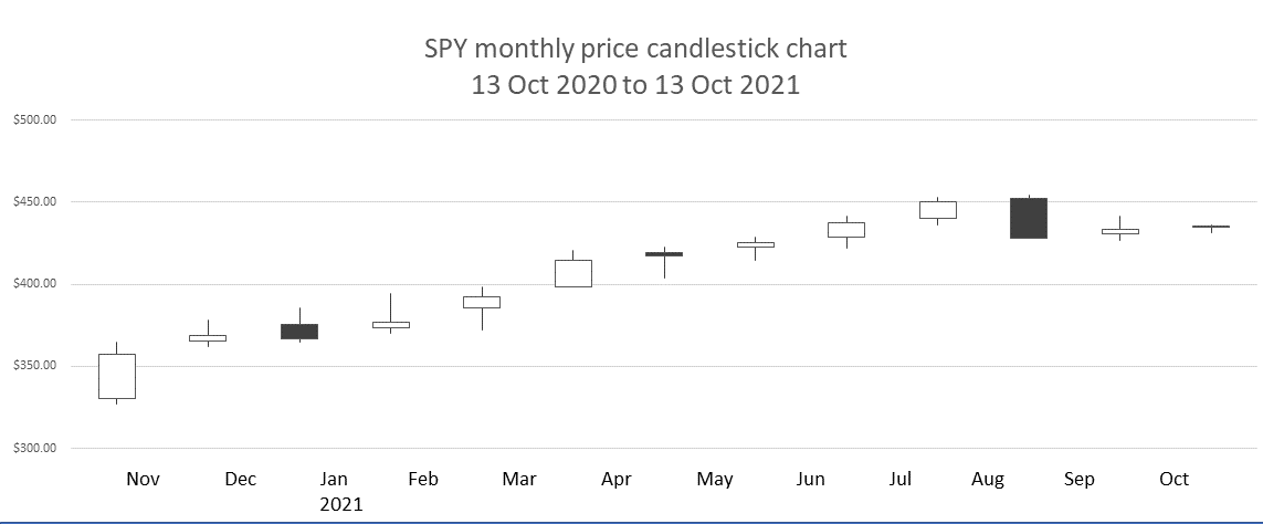
Now let’s compare candlestick price charts for the same period for the same ETF, SPY from 13 October 2020 to 13 October 2021. This is what we get.
2)Stock data source: Yahoo Finance, all charts by Bad Investment Advice.
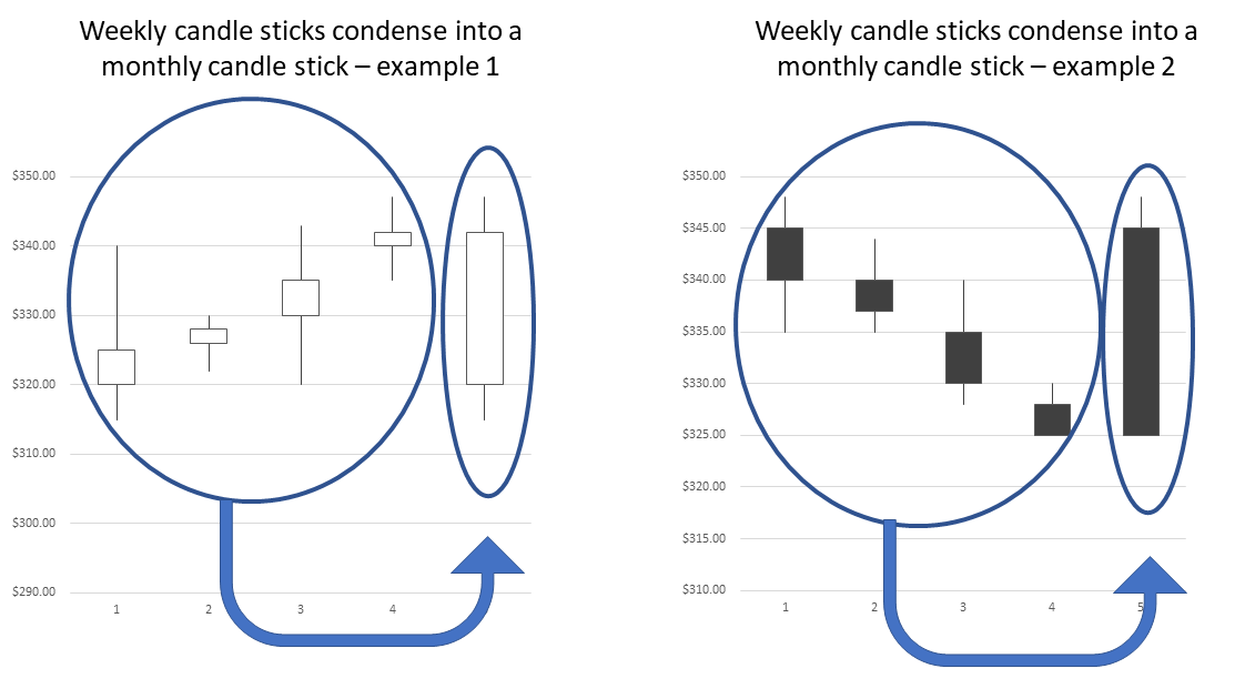
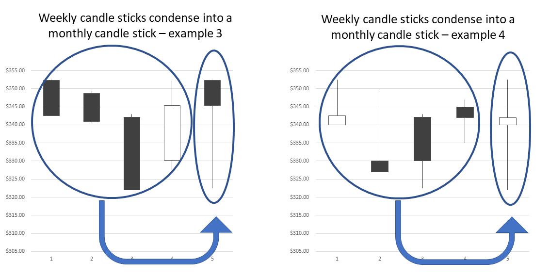
Straight away we can see that a candlestick chart with a year of daily price data isn’t much use if you look over the whole period. What is interesting to see is how the more detailed price movements that happen within weekly periods become condensed into single monthly price candles that often display the information differently. Or at least in a different way that makes it easier to miss the detailed movements within the period.
If we take a closer look at a few examples of individual months and the weeks that comprise those months we can more clearly illustrate this point.
What different candles mean
As we’ve already noted a price candle has a body and a wick above and below the body. The height of the body indicates the difference between where the price opened and where the price closed in the period we are looking at.
For stocks that trade in markets that open for distinct times of the day and then close the rest of the day, where the price opened and where the price closed is very relevant. This gives us a broad view of where the interplay between buyers and sellers started and where it ended over that discrete period.
This is one reason why daily candlestick stock charts are very relevant. Stock prices are constantly adjusting to the change in buying and selling pressure as traders and investors react to news and events. They are free to act immediately while the markets are open, but any news or events that happen while the market is closed only get reflected when the market opens again at the beginning of the next trading day.
Weekends have a similar and more pronounced effect. Any news or event that is going to affect investor sentiment about a stock price will have to wait between market close on Friday and the market opening on Monday to be reflected in the price.
There are other observations we can make about what a particular kind of candle tells us. In this case, let’s use daily candles as they are the easiest to talk about.
If a daily candle has a small body that means the price closed very close to where it opened. So buyers and sellers ended up in pretty much the same place where they started out.
The converse is also true. A daily candle with a very large body tells us that buyers and sellers ended up in a very different place than where they started the day’s trading. Either there was considerably more buying pressure pushing the price up, or there was considerably more selling pressure pushing the price down.
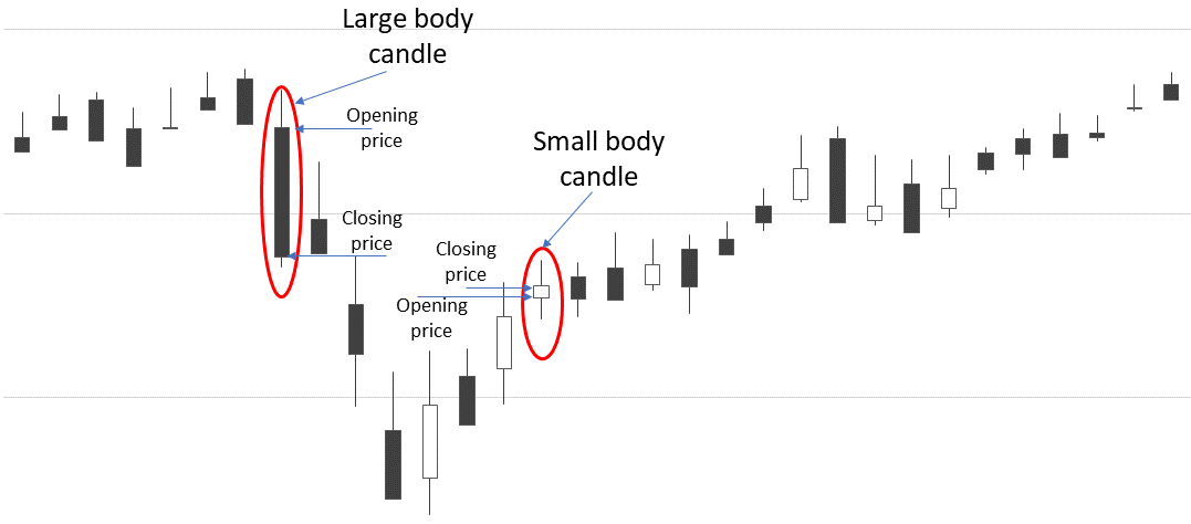
Another observation is that if we have a very long wick on the top of a daily price candle, that means during the day there was a great deal of buying pressure that overcame the sellers for a while, but by the end of the day the sellers returned and knocked the price back down to where it closed.
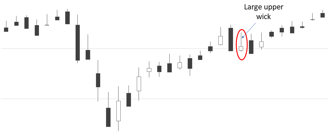
We get the same phenomenon on the bottom of a candle. If there is a very long wick on the bottom of a daily price candle, then for some of the time during that day sellers were overwhelming buyers and pushed the price down. However, by the end of the day, the buyers returned and push the price back up to where it closed.
How candles form patterns
So, we get a handle on how buying and selling pressures are reflected in individual price candles. Then we can more easily appreciate how patterns of candles can indicate the probability of the price either continuing to move in one direction or reversing direction.
When the price continues to move in one direction, that is called trending price. When the price changes direction, that is called reversing trend.
If you are unfamiliar with the major candlestick patterns that indicate either price trend continuation or price trend reversal, here is another article that explains candlestick patterns.
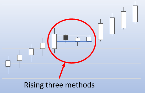
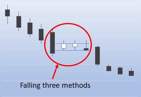
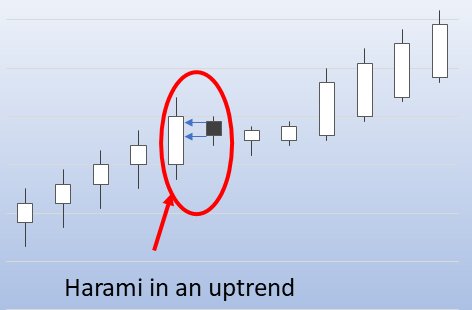
For our purposes, we will just note that price trend continuation patterns include
- rising three methods,
- falling three methods,
- a harami in an uptrend,
- a harami in a downtrend
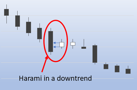
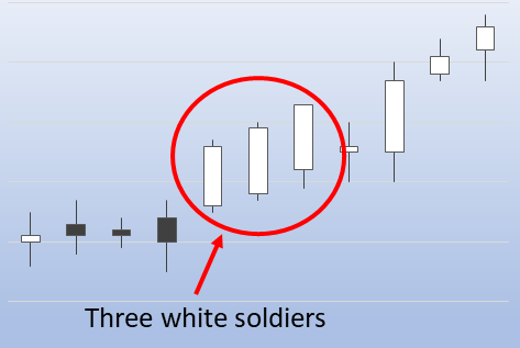
- three white soldiers,
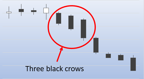
- three black crows
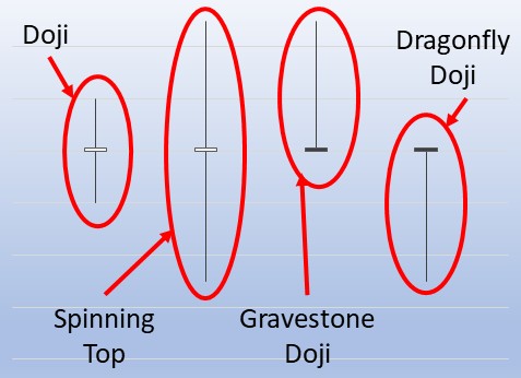
Candlestick patterns that are more likely to indicate a stalling or weakening trend and hence the possibility of a trend reveals include
- dojis of all kinds,
- bullish hammer,
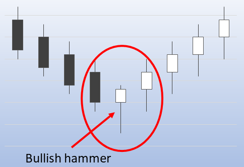
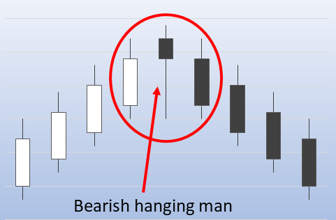
- bearish hanging man,
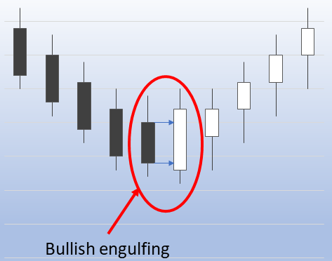
- bullish engulfing patterns,
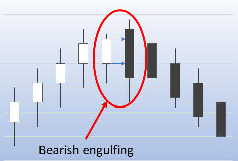
- bearish engulfing patterns,
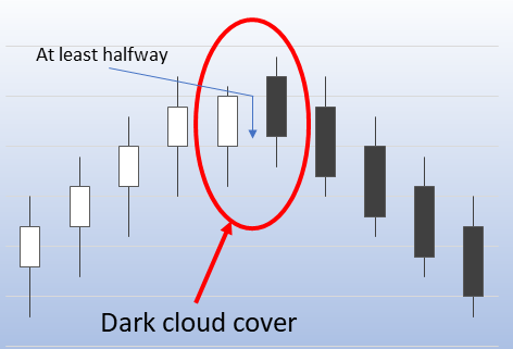
- dark cloud cover,
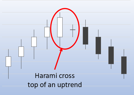
- a harami cross at the top of an uptrend
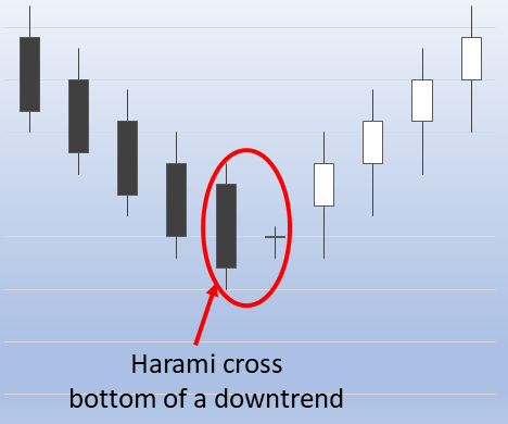
- a harami cross at the bottom of a downtrend
From price patterns to price formations
Price candlestick patterns typically encompass up to six candles or so. There are also important shapes that form in price charts over longer periods, or better said that form using more data points. These are called price formations.
For our purposes the common continuation price formations are
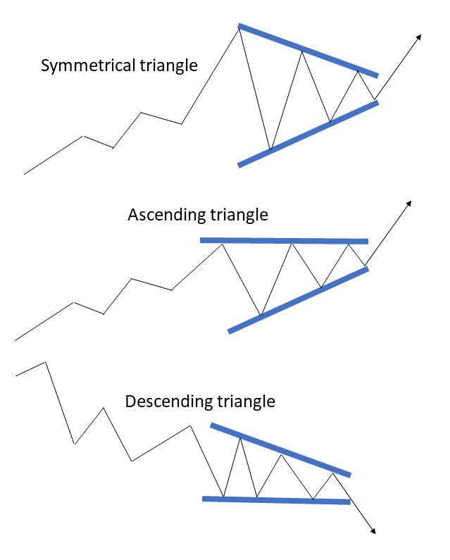
- triangles,
- pennant, and flags
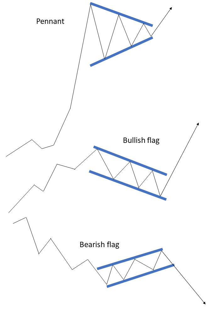
Well, we should add a qualifier here. Triangles can be either continuation or reversal patterns. A triangle that is symmetrical around the horizontal axis tends to indicate a slow-down allowing a trend to consolidate before it continues. Also, if the slope of the triangle matches the direction of the trend then this is likely to indicate a continuation. If the slope of the triangle is opposite to the direction of the trend, then this is like to indicate a reversal.
A pennant looks much like a symmetrical triangle but comes immediately after a dramatic almost vertical gain in price that looks much like a flagpole. The pennant is usually just a period of consolidation before the price moves higher still.
Flags are also periods of price consolidation. The flag is characterized by narrow parallel trend lines where the price consolidates usually in the opposite direction to the main trend before the trend resumes.
So a bullish flag is a period of narrow downward price consolidation in a general bull trend. A bearish flag is a period of narrow upward price consolidation in a general bear trend.
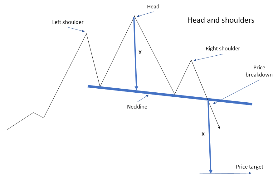
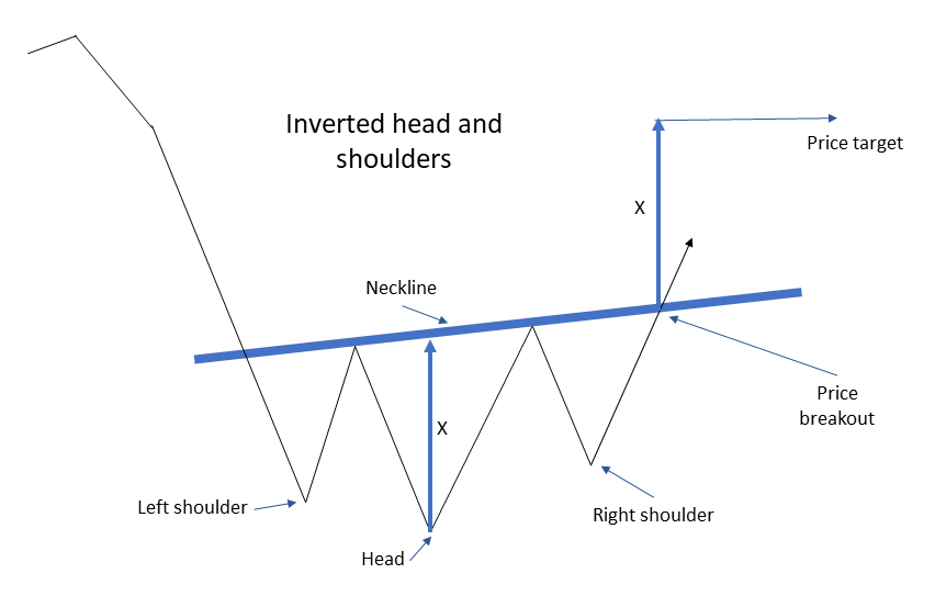
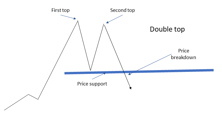
Then of course there are price reversal formations,
- head and shoulders,
- inverted head and shoulders,
- double top
- and double bottom
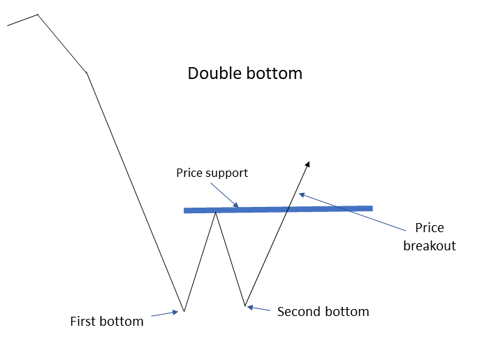
It is often easier to discern these price formations with line charts rather than candlestick charts especially when the price action is volatile.
Different timeframes
The important point with price charts that cover different timeframes is that they show trends over different periods. A price trend can be upwards over a long-term, say a time horizon of two years or more. Within the last two-year period there could easily be sustained shorter periods of downward price movement.
Now let’s relate patterns and formations to how we use daily, weekly and monthly charts. Firstly, let’s consider daily charts.
Daily charts and swing trading
As we said we use daily candlestick charts to find position entry points for swing trades. What we are looking for with swing trades is price patterns and formations that are likely to be carried in one direction by pressure from either buyers or sellers creating momentum.
These position entry points are going to be either just above or just below levels of price resistance and support. There are basically four ways this kind of price movement happens.
As price increases towards a level of resistance, selling pressure increases This selling pressure can often be from profit-taking but also short-sellers getting in on the act anticipating a decline. There are two possibilities.
Either the price bounces off resistance. The short-sellers are onto a winner and those who bought in at the high are looking at a pull-back and if they set a tight stop-loss order they will be stopped out, contributing to selling pressure which will create momentum pushing the price lower.
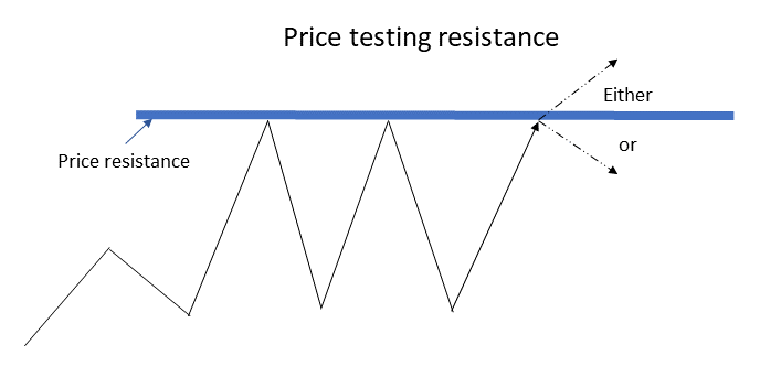
Or the price breaks through the resistance level and advances on the upside. Here the short-sellers will start to cover their positions, adding buying pressure and upward price momentum as other buyers take long positions seeing that a level of price resistance has been broken.
On the other side of this picture, we can have the price descending towards a level of support. Recognizing a level of support, buyers increase their positions also short-sellers with open positions will likely close their positions at or just above a known support level. Again broadly speaking there are two possible outcomes.
Either the support holds, the buyers are winning and more buyers join the party seeing that the support level was confirmed adding buying momentum, and pushing the price higher.
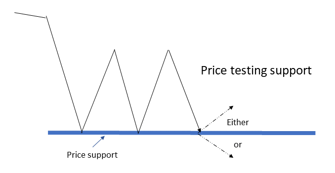
Or, the price breaks down below the level of support. Traders holding long positions will likely have set stop-loss orders just below the level of support. These stop-loss orders will be triggered adding to the downward price momentum. Price breaking below a level of support is also attractive to short-sellers opening positions. All of this increases the selling pressure and downward price momentum.
Much of the trading activity around these levels of price support and resistance is computer-driven. Daily price candlestick and volume charts are most useful for the swing trader spotting these kinds of setups.
Even though we have focused here on candlestick patterns, you will also see price formations in daily candlestick charts that will also give indications of whether a level of price support or resistance is likely to be respected or broken.
In terms of the period we should be examining for swing trade positions held for a few days to weeks, we need to be looking at daily charts that go back three to six months. That is the timeframe to be checking for patterns and formations.
We always want to zoom out to a larger timeframe to get a sense of where the longer-term trend is going. So even for swing trade purposes, we want to check weekly price charts going back a few years to get the general trend.
Weekly charts and their uses
With weekly price charts, we move to a larger timeframe. Weekly charts are where we look for price formations for positions we are going to hold for many months and even years. These kinds of positions are often referred to as Platform Position Trades.
There is one important difference between price action over weekly and monthly periods as opposed to daily price movement. Institutions who are either building or dismantling positions in stocks and sectors, often need to do so over weeks and months so they avoid the volume of their trades causing very dramatic price changes.
When institutions are building positions in stocks and sectors that is called accumulation. When institutions are dismantling positions in stocks and sectors that is called distribution.
Though institutions will attempt to disguise accumulation and distribution they cannot do so entirely and the signs will be there in the price action and trading volume. We should also keep an eye on the published information on institutional investors, though that information will lag the action.
Accumulation and distribution – the signs
Institutional accumulation tends to be characterized by an extended period of sideways movement in price within a narrow range. Trading volume on up days will generally be higher than the trading volume on down days. One very welcome price formation investors want to see during periods of accumulation is the cup and handle with a large base.
Here is an explanation of the cup and handle formation.
Distribution can look similar except that trading volume will be higher on down days.
Ideally, we want to take long positions in stocks and sectors when they are being accumulated by institutions. Then we would hope the price will break out above resistance levels that have previously held and ride the stock up as crowds of smaller investors jump on board.
The main difference between swing trading and platform position trading is that with swing trades we are looking to profit from short-term momentum moves while with platform position trading we are looking for more significant gains that will typically take weeks or months to deliver.
Monthly charts
Monthly charts of whole sectors and indicators are useful for determining the stage of economic and market cycles. Monthly charts of individual stocks can reveal where a stock is going in terms of the evolution of the company. In both cases, we need to look at many years and even decades of price data. It really only makes sense to use monthly line charts for this purpose.
The market goes through periods of price advancing, topping out, then decline, and then bottoming out to prepare for another period of price advancing.
The period of price advancing tends to take a few years or more. This is generally called a bull market. The topping-out phase can last around a year depending on how strong and long the bull market lasted. The declining phase or bear market is when the market pulls back anywhere from 10 to 50 percent. A bear market tends to be much shorter than a bull market. The bottoming out phase is when institutions start accumulating again in preparation for another bull market advance.
When you are investing for the long term it is important to know where the general market is going and which sectors are either leading the advance or the decline and which are being accumulated or distributed.
This article explains market and economic cycles.
Individual stocks also go through their own evolution.
The classic life cycles of a stock would be
- The start-up phase, characterized by high spending on research and development. The company may not even be publically listed at this stage.
- The growth phase, where sales revenues are growing rapidly, the company launches new products and services and reaches into new markets.
- The consolidation phase, when the company maneuvers itself into more dominant positions within its markets. Sales may still increase but more as a result of gaining market share than product innovation. The products and markets are more mature than in earlier phases.
- The declining phase, when a company’s products are becoming obsolete and it may need to transform itself or go out of business.
The start-up phase is highly speculative, pretty much the preserve of venture capital and usually closed to the individual investor. Some companies will launch an IPO in this stage if there is sufficient buzz in the business or industry. It is also possible for the individual investor to participate in startup companies by investing in Special Purpose Acquisition Companies or SPACs.
The growth phase is where most of the stock price appreciation takes place. This can be a bumpy ride as the price will easily get knocked back down especially if the market valuation in terms of price/earnings is very high and the market or sector gets hit. However, if you are able to get in at the beginning of the growth phase and hold the stock until the company reaches the next stage, which may be many years, then you should see big gains.
The consolidation phase is where a company may be losing its luster as a growth company. On the other hand, if a company is well managed then profitability and earnings should stay healthy. This is where companies can be excellent payers of dividends to shareholders. Income portfolios will look to hold significant positions in solid dividend-paying companies.
You are going to need to look at more than just monthly stock charts to determine whether a company is transitioning from the growth phase to the consolidation phase. This is going to be as much about business fundamentals as anything else, though a long-term view of monthly charts can indicate how well a company’s share price holds up when the market is in a downturn.
But just for argument’s sake, let’s say you have identified a company that has established a strong history of steadily increasing dividend payouts and has solid earnings and a healthy balance sheet. It would be worth looking at many years of monthly price data to see if there are any seasonal patterns observable in the stock price. If you are going to build a position in that company over the long term then you could favor buying the stock when the price is at a seasonal low.
Reference materials for this article.3)5 Most Powerful Candles 4)Price entries and exits 5)Technical analysis 6)Quora discussion 7)Weekly charts
Questions and answers
Q. How do you trade with multiple timeframes?
A. Let’s say you are looking to enter and exit positions over say one to three days. First, zoom out to look at the overall price trend between three to six months. Determine whether over that time frame the price is trending up, down, or sideways and look for areas of price support and resistance. Then zoom in to about one month of daily prices and look for candlestick patterns when the price approaches levels of support or resistance.
Q. How do you trade using a daily chart?
A. That depends if you are a day trader or a swing trader. Start with a daily price candlestick chart and look at the last six months for trends, and levels of major support, and resistance. Then zoom in to the last month and look for classic candlestick patterns that indicate trend continuation or trend reversal.
Q. How do you trade with weekly charts?
A. Use many years’ worth of price data to determine whether a stock is likely to be in a phase of accumulation or in a phase of distribution. Look at weekly price data for the main market indexes as well for the same period to see what is the likely stage of the market cycle.
Affiliate Disclosure: This article contains affiliate links. If you click on a link and buy something, I may receive a commission. You will pay no more so please go ahead and feel free to make a purchase. Thank you!
It has often been said that there is no better investment than your own financial education. One great way to accelerate your financial education and your investing success is with the American Association of Individual Investors, the AAII. When you join the AAII, you get access to reports, courses on investing, risk management, asset allocation, retirement planning, managing retirement finances, and other resources, all for a single annual membership fee.
Single-page summary
Here is a single-page PDF summary of trading using daily, weekly and monthly charts.
I hope you found this article interesting and useful. Do leave me a comment, a question, an opinion, or a suggestion and I will reply soonest. And if you are inclined to do me a favor, scroll down a bit and click on one of the social media buttons, and share it with your friends. They may just thank you for it.
You can also subscribe to email notifications. We will send you a short email when a new post is published.
Disclaimer: I am not a financial professional. All the information on this website and in this article is for information purposes only and should not be taken as personalized investment advice, good or bad. You should check with your financial advisor before making any investment decisions to ensure they are suitable for you.
Affiliate Disclosure: This article contains affiliate links. If you click on a link and buy something, I may receive a commission. You will pay no more so please go ahead and feel free to make a purchase. Thank you
References
| ↑1, ↑2 | Stock data source: Yahoo Finance, all charts by Bad Investment Advice. |
|---|---|
| ↑3 | 5 Most Powerful Candles |
| ↑4 | Price entries and exits |
| ↑5 | Technical analysis |
| ↑6 | Quora discussion |
| ↑7 | Weekly charts |
Hey thanks a bunch for this! It’s really informational and useful especially for people like me who are either thinking or just started in the trading area.
I’m still not too sure about trading but I’ve heard quite a few good things said about it and of course it does come with its cons too like anything!
I’d definitely want to give online investing and trading a go sometime maybe after a lot more research!
Thanks for letting us in on trading.
Hi and thanks for the comment. I am glad that you found the article interesting and useful. Good luck when you do take your first steps in online investing. Best regards, Andy
I am very new to investing and trading and I am still trying to find my way, however, the content you provide in your article is amazing. There are so many different aspects covered here.
I can honestly say I’ve gained a lot of insight into investing and trading from reading your article even I am still struggling with some of the basics.
The important point I learned here was the need to look at different timeframes to understand how smaller-scale trends can develop within larger-scale trends.
well done, great article
Hi and thanks for the comment. I am glad it was useful. Best regards, Andy
I can only be awed by how you put all this together, Andy. Deeply impressed. I’m not saying I understand any of it, of course – but I would if I had a few shekels to spare.
Thanks for the positive feedback. I must admit this one took me quite some time to put together. The article is definitely intended for people with some practical experience otherwise they would not be asking themselves this kind of question. btw you know what they say, take care of the groats and the shekels will take care of themselves.
Trading stocks can be such a lucrative business but the key is knowing in my opinion to make the right moves or at least try to so you can be in a position to make a profit. I have heard of people that are involved in stock trading who have made millions of dollars. I think though that stock trading and always making a profit is tricky. Thanks so much for the informative post.
Hi and thanks for the comment. I am glad that you found it informative. Best regards, Andy
I studied finance in college and even worked for a financial advisor as my first job after school. The technical analysis of financial instruments was one of the more interesting parts of the job, but back in those days, the tools were far less advanced. I am no longer working in the industry but have recently renewed interest in the markets. This was a great reminder of terms I haven’t seen in years and a helpful guide to using the charts to make smart investments. Thank you!
Hi and thanks for the positive feedback. I appreciate that coming from someone who is formally trained in this field. Thanks again and best regards, Andy
I have a lot of friends that are into trading so I know that they will appreciate this post. I also know that they are struggling to make an income so do you have any advice that I can give them? Are there any tactics they can use to start making money?
Hi Daniel and thanks for the question. Though the question itself is simple, a genuine answer has to be somewhat involved. If your friends are trading I assume that implies they are taking short-term positions and looking for profits to materialize in a matter of days or weeks. Then this is really swing trading and techniques used in swing trading would be most appropriate. This article speaks to that in the early parts about using daily charts to trade.
Here is another article on Swing Trading that should also help
.
Good luck and best regards, Andy
I love using charts at my work and my personal life. It helps me see improvements and problems occuring at the moment. Then I can act based on those charts. I sadly do not know much of trading, but would like to know more how to do trading. Do you perhaps know where I can learn how to trade as a beginner?
Hi and thanks for the question. If you are looking for resources for beginners learning to trade, I would suggest
This article on swing trading
and
This article on using moving averages to trade
But in general, there are many free resources available on the internet. You can also access some excellent educational materials through your broker if you have an account with one of the larger ones. For example, ETrade has many excellent trading videos.
This article compares some of the major brokerage providers in the US.
I hope this helps, Best regards, Andy
I have had an investment porfolio for years but have not managed it myself very long. I was raised with the idea of buying utilities looking for stability and long term growth. I will have to read you article a few more times especially the part about the triangles, but it is amazing. It is clear and comprehensive. I have let others manage my investments because the variety of investments is almost infinite and I have not know how to choose. I think I am going to begin small, invest in a few stocks and learn to follow them using this article as a foundation. Thanks. We’ll see what happens.
Hi and thanks for the comment. I am glad that you found the article useful. I wish you all good luck in your investments. Best regards, Andy
Hey, there! Being able to identify a bullish trend. Or also being able to spot a bearish one can help our decision-making process. I have been focused on learning how to read charts. I will now study monthly charts and apply what I learned from your post. Thank you very much!
Hi and thanks for the comment. I am glad that you found it interesting. Best regards, Andy